One thing that always needed an update, and that I wasn't pleased with, was Trihill's logo. The initial logo was designed in a few hours and was good enough but was'nt perfect. Fast forward a few months down the line as we do a site wide redesigned we decided that it was time to give our old logo a facelift.
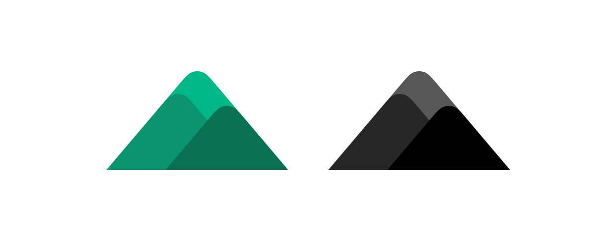
Our old logo has some aspects that we really loved, the visual of three hills in various depths represented by different shades of our brand colors, we also have a monochrome dark variant.

However, there were certain elements that didn't quite meet our expectations. The distinction between the three hills wasn't always clear, which didn't effectively convey the essence of our brand name, "Trihill." Additionally, we felt limited by the lack of variations or colorways for our logo, especially when used in different contexts and backgrounds.

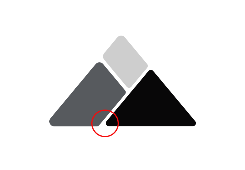
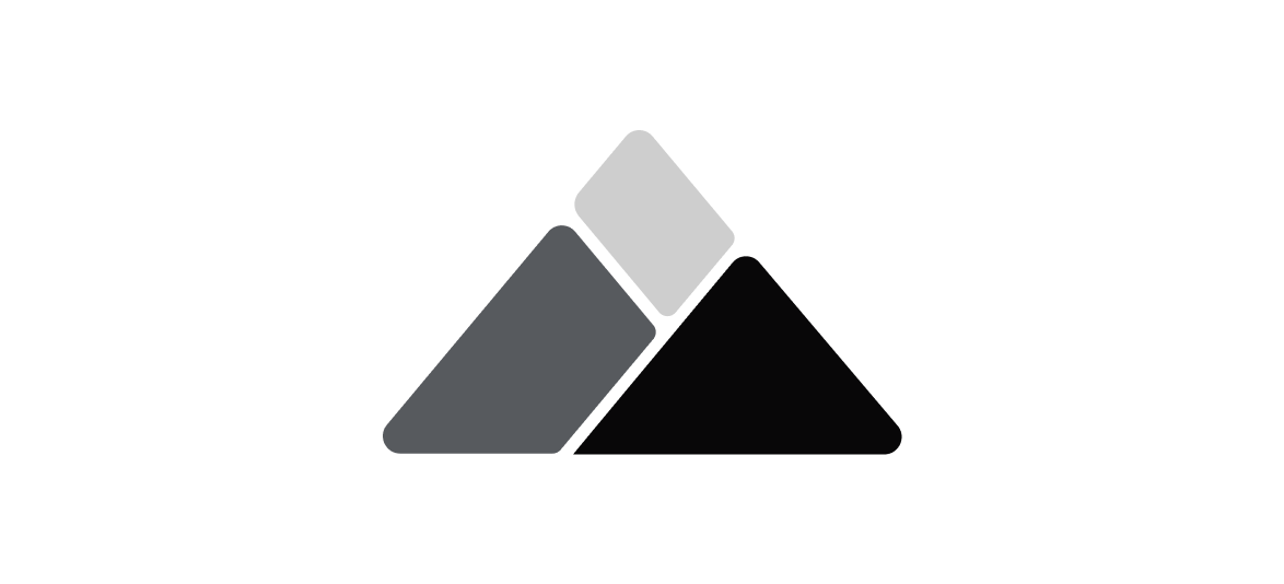
Several attempts and iterations later we came up with this version where theres a separation of the hill silhouette. We loved it but the curve where the first layer meets the second layer didn't feel right. We made some more adjustments to that area to sharpen the edge which was visually appealing.

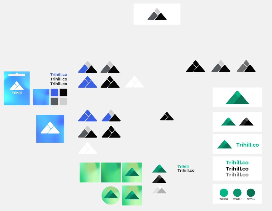
During the design process, we explored various iterations and variants before finalizing the set of four icons and the four logo redesign variants. This version succinctly communicates the process of exploration and the eventual outcome without unnecessary repetition. There's also a bonus Figma screenshot too.

